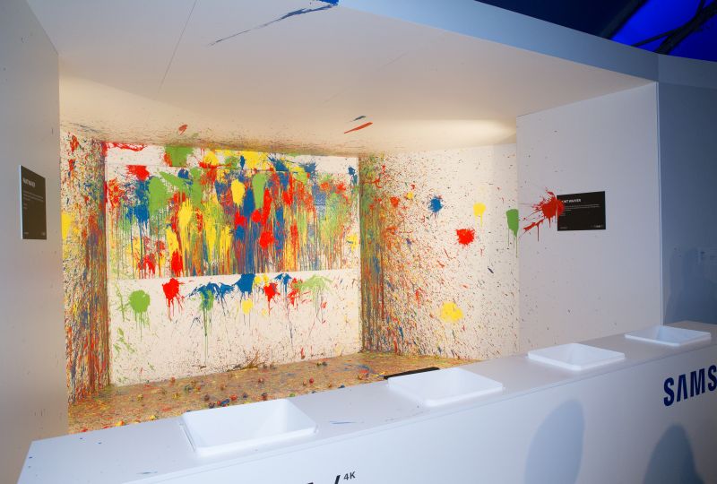
Colour, colour everywhere
Colour surrounds our everyday life, so why wouldn’t colour be important in our projects?
We understand the challenges of matching Pantone colours to paint and the difference between RGB, PMS and CMYK. We are a big fan of Pantone, but paint doesn’t understand the appeal; our specialists have pulled together some top tips to understanding your colour journey.
Matching Pantone to paint
Pantone Matching System (PMS) colours are produced by printing ink on paper, so finding a paint that is an exact match can be challenging. It all comes down to the eye of the beholder.
First thing to understand is, paint is impossible to control. Variations in pigment, mixtures and the integrity of the machine will all factor into what the final colour will be. Paint also looks different when it’s wet as to when it’s dry, and it will look different in the can as opposed to on wood, or on plastic.
There are machines that can ‘colour match’ but be aware these give the closest available paint colour – it will not be exact, but close enough that you might not be able to see the difference.
We know colours, we know PMS colours and we know paint – so we will always find the closest match for you but we ask that all of our partners understand the challenges.
What the heck is RGB?
RGB stands for red, green, blue, and it’s a colour additive model where these three colours are added together in various ways to reproduce a broad array of colours. Its main purpose is for the representation and display of images in electronic systems like on TV or on computer screens. This colour model is dependent on the device on which it is being viewed, as different devices detect or reproduce a given value differently, because the colour elements like phosphors or dyes in respond differently to RGB levels.
RGB is designed to produce the best colours for digital and web, if we are provided artwork in RGB and it’s to be printed, we will convert the colours to their closest CMYK or PMS colour.
PMS
Pantone colours are a standardised system of colours primarily used for printing, but can be used in the manufacture of fabrics and plastics. Pantone is considered the world-renowned authority on colour and standard language for colour communication from designer and manufacturer to retailer and customer.
Our team might not be walking down the catwalks of Paris Fashion Week, but we know colours and we are pretty excited about the 2017 Pantone colour of the year – Greenery!
According to Pantone, Greenery is a refreshing and revitalizing shade; a symbol of new beginnings. Ask us how we can integrate this colour into your next custom project.
“Greenery is a fresh and zesty yellow-green shade that evokes the first days of spring when nature’s greens revive, restore and renew. Illustrative of flourishing foliage and the lushness of the great outdoors, the fortifying attributes of Greenery signals consumers to take a deep breath, oxygenate and reinvigorate.”
Check it out: https://www.pantone.com/color-of-the-year-2017
CMYK
CMYK is a four colour process, used mainly when a product is to be printed. CMYK stands for Cyan, Magenta, Yellow and Key (black), the printing process layers these tones creating new ones, to produce truly vibrant colours for all your printing jobs. It works by masking colours on a lighter, usually white background; the ink reduces the light that would otherwise be reflected.
Our expert team here at Concept Craft can help you find your best paint, print or colour solutions for any project.
If you have any questions about colours, or want to be in vogue by using Pantone’s colour of the year, have a chat to our team.